Gamifying Sports Predictions

Design System & UX Designer

Lebi (gamelebi.com) was born as a sports prediction gaming platform with no visual identity, no design structure, and no clear product definition. I joined from day one and led the creation of the design system, user experience architecture, and validation with real users.

This was more than just designing screens — it required strategic thinking, team alignment, and user insight to bring an idea to life. I worked closely with stakeholders to:

  • Define the product’s positioning (Is it a game? A fantasy league? A social bet?).

  • Establish a modular design system for fast development.

  • Structure user flows that simplify predictions, not overwhelm.

  • Validate ideas quickly using AI simulations and early-stage usability testing.

Client

Lebi (MoveUp Media)

Role

Design System Ops & UX Designer

duration

9 months (2024-2025)

location

France/Brazil (Remote)

Skills

User Research, Data Analysis and Synthesis, Prototyping and Testing, Design Systems & AI Researcher

Challenge prompt

Create an engaging, game-like experience for users predicting sports results — starting from zero, and turning scattered ideas into a fully validated digital product.

1. The Initial Challenge

I was tasked with designing the experience for a product that didn’t yet exist. All we had were loose ideas and the need to create something from scratch — something intuitive, trustworthy, and scalable.

Although the process may seem chaotic at first glance — filled with uncertainties, iterations, and complex patterns — this is a natural part of immersion and discovery. Each loop contributes to deeper understanding. Through analysis, ideation, and prototyping, we move gradually toward clarity and focus. What begins as ambiguity becomes a structured path toward meaningful innovation.

2. Research & Immersion

Before jumping into design, I led a multi-step investigation to uncover user needs, market gaps, and strategic opportunities for Lebi. This stage was divided into 4 key phases:

Step 1: Competitive Benchmarking

I analyzed top platforms in the sports prediction and betting space to understand:

  • How they structured onboarding, predictions, and reward logic

  • Visual trends and tone of communication

  • Where users tended to feel lost or overwhelmed

Key Insight: Many platforms leaned too heavily into betting jargon, pushing away casual users.

Step 2: User Types & Personas

Using assumptions from secondary data and early internal insights, I created:

  • Four main player personas:

    The Casual Fan (wants to try without commitment)
    The Hardcore Fan (seeks to win and climb rankings)
    The Bettor (loves stats and probabilities)
    The Social User (enjoys connecting with other players)

Pain Point Example: “I want to play but I don’t understand how this works — is it a game or a bet?”

Desk Research & Benchmarking
Empathy Map

Step 3: User Journey Mapping

I mapped the end-to-end experience from a new user’s perspective, including:

  • Entry points (landing pages, social ads)

  • First prediction flow

  • Feedback loops (rewards, results, standings)

Friction Zones Identified:

  • Unclear CTAs at entry

  • Vague explanation of prediction rules

  • Lack of guidance on how prizes or rankings worked

Step 4: Strategic SWOT Analysis

I conducted a SWOT analysis to align business goals with UX strategy.

  • Strengths: Lebi offers engaging prediction games, intuitive design, and strong community features that boost retention.
  • Weaknesses: As a new product, it faces low brand recognition, limited resources, and technical challenges.
  • Opportunities: Rising football fanbase, new technologies, and strategic partnerships.
  • Threats: Strong competition, shifting user preferences, and regulatory risks.
User Jouney Map: Hardcore Fan
SWOT Analysis

3. Conceptualization & Design Strategy

With research insights in hand, I moved into defining the strategic backbone of the product. The goal was to ensure that every design decision was aligned with user needs, business goals, and technical feasibility.

Defining Core Concepts

I distilled the platform’s purpose into three design principles:

  1. Clarity – Make the game mechanics and reward system intuitive for all users.

  2. Gamification – Turn predictions into a playful, engaging journey.

  3. Trust & Safety – Use design to communicate fairness, transparency, and security.

Structuring the Product Experience

Using early content and flow sketches, I mapped out:

  1. Key user flows (Join, Prediction, Results)

  2. Screen hierarchy and navigation structure

  3. Entry points for logged and guest users

This helped us create a cohesive architecture even before we began visual prototyping.

Establishing the Visual & Interaction Language

I set the tone for the visual identity by focusing on:

  1. Friendly, approachable design with game-like elements

  2. Scalable UI patterns and component logic

  3. Tokens for consistent spacing, color, and typography

This would later evolve into our full Design System.

4. Wireframing & Responsiveness

With a solid conceptual foundation, I translated user flows into low-fidelity wireframes, focusing on layout clarity and responsiveness.

💡 What I did:  Designed wireframes for key flows: Onboarding, Prediction, Results, and Join. Prioritized mobile-first layouts, then scaled up for tablet and desktop. Validated structure and information hierarchy with internal stakeholders

5. Product Architecture & High-Fidelity Prototypes

Once we aligned on flows and structure, I moved to high-fidelity design, partnering closely with developers to ensure feasibility and scalability.

🧩 Key Actions: I co-defined the core app architecture with developers and designed high-fidelity screens for: Home (Logged-in), Guest Home, Make Prediction, Leaderboard, Dashboard, and Challenge Details. I also created assets and interaction specs using Figma components and tokens to ensure consistency and scalability.

Final high-fidelity UI screens (hand-off documentation) showcasing visual identity, interactions, and component behavior in real scenarios.
Full layout exploration, including mobile and desktop views, wireframes, and information hierarchy (my desktop).

6. User Validation & Discovery Second Round

With the first version designed, we returned to real users for feedback. This second Discovery phase focused on validating usability and perception.

🔍 User Research Activities: I conducted 20+ interviews with both sports fans and newcomers to prediction platforms. Through qualitative feedback, I gathered insights on clarity, trust, and enjoyment, and mapped key pain points and moments of user confusion to guide the next iteration.

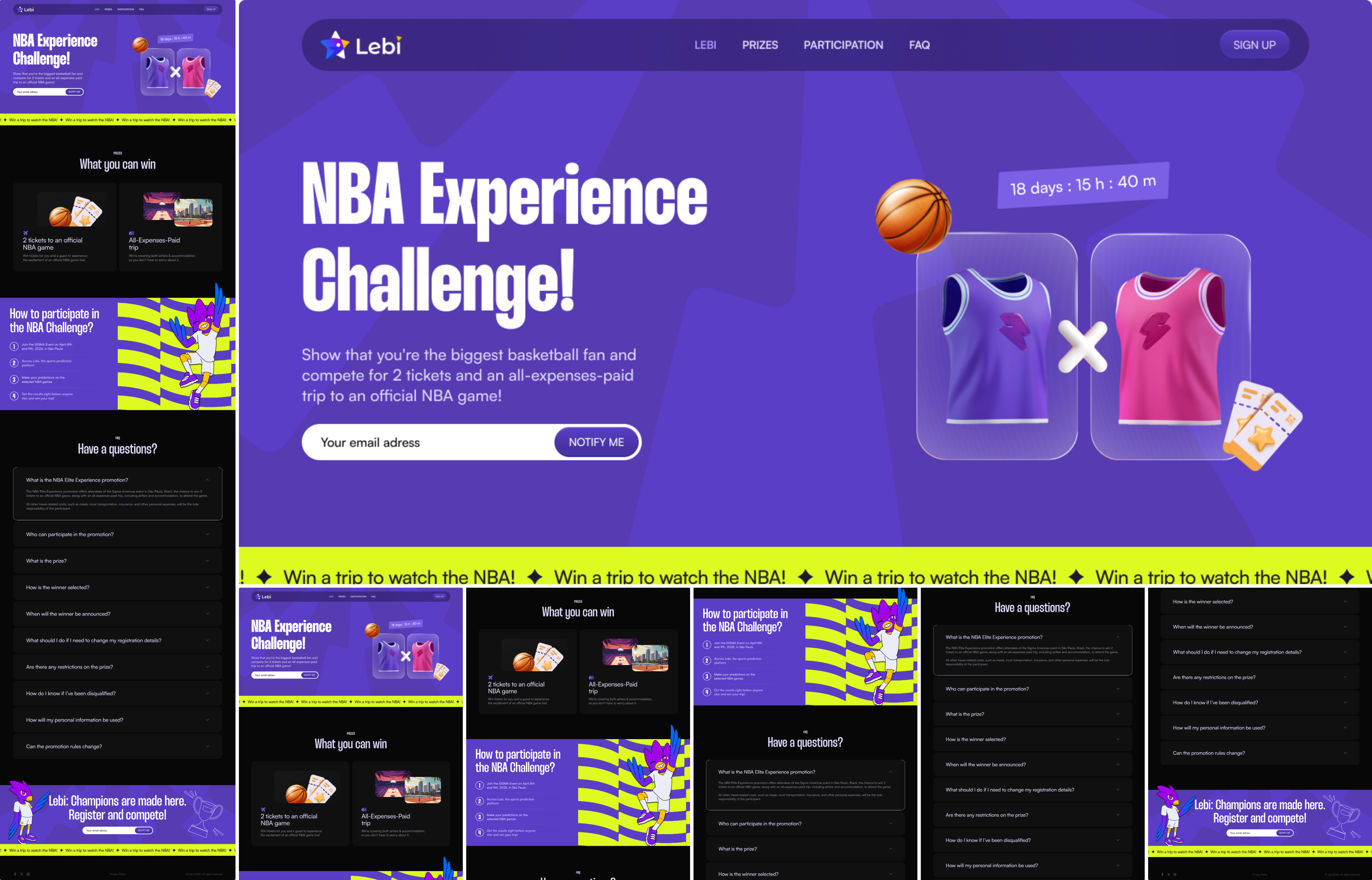
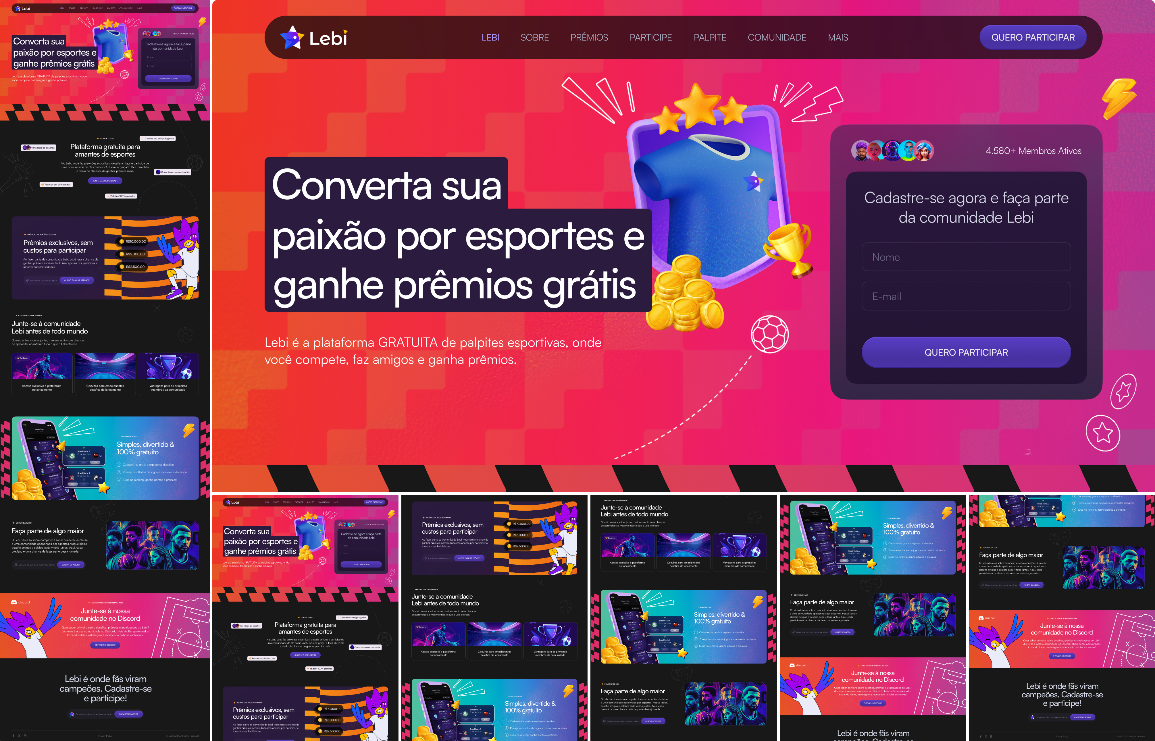
7. Redesign & Iterations

After analyzing the insights from the second Discovery round, we realized a key structural issue: in the Alpha version, both guest and logged-in users were seeing the same page — creating confusion, poor engagement, and unclear onboarding flow.

🔄 Key Iterations: 

  • Guest vs. Logged-In User Flows:
    We segregated the experiences.
    Now, guest users land on a dedicated exploration page, designed to introduce the platform and build curiosity before signing up. Logged-in users, by contrast, access a personalized dashboard, with immediate access to predictions, rankings, and custom configuration options to make faster and smarter decisions.

  • Creation of Two New Landing Pages:
    To strengthen the onboarding process and better market Lebi, we created two additional landing pages:
    • One to onboard users into challenges directly
    • One to promote Lebi strategically at events and marketing campaigns

  • Strategic Approach:
    These changes were guided by a Product-Led Growth (PLG) mindset: using the product itself to drive activation, engagement, and conversion without heavy reliance on external marketing.

Before vs. After Overview

Before:

  • Same experience for guests and logged-in users

  • Lack of context and motivation to register

  • Unstructured and flat navigation

After:

  • Clear separation between exploration and personalized usage

  • Stronger onboarding flow tailored to user readiness

  • Landing pages are strategically crafted to enhance product visibility and conversion rates

Before
In the Alpha version, guest and logged-in users shared the same screen with no distinction. The lack of separation created friction, limited engagement, and made the onboarding experience unclear — users were not properly guided or motivated to dive deeper into the platform
After
We created a personalized Home experience for guest users, helping them explore the platform before signing up.
A new home experience designed to empower users with quick access to rankings, challenges, and personalized insights right after signup.
New onboarding landing page designed to introduce Lebi, highlight core benefits, and drive user sign-ups through an engaging, playful experience.
Promotional landing page crafted to boost engagement through a gamified NBA challenge, offering users a direct and exciting entry point to the platform.

8. Launch & Learnings

After implementing the redesigns and launching the new flows, we positioned Lebi for a stronger growth trajectory.
The strategic focus on Product-Led Growth (PLG) combined with clear guest and logged-in experiences significantly improved the user journey.

🚀 Key Achievements:

  • Continuous research and user feedback are essential to drive meaningful product evolution.

  • Separating guest and logged-in flows greatly improved onboarding clarity and engagement rates.

  • Iterative, user-driven design decisions, even small ones, created a stronger foundation for future scalability and growth.

💡 Key Learnings:

  • Discovery never stops: Continuous user feedback was essential at every stage — even after the first launch.

  • Clearer journeys drive better results: Removing friction at the entry point significantly impacts activation and retention.

  • Small improvements compound: Segmented landing pages, onboarding guidance, and micro-interactions added up to big UX wins.

This project reinforced my belief that great products are built by deeply listening to users, moving fast, iterating often, and keeping the experience at the center of every decision.

Next Steps:
Following the launch, the focus will be on closely monitoring key metrics such as activation, retention, and referral rates. We plan to continuously test and optimize the new landing pages based on real user behavior, ensuring they effectively drive engagement. Additionally, expanding gamification elements and rewards strategies will be essential to deepen user involvement and sustain long-term growth.

Other Projects

Magalu Cloud

Leading a multifaceted team to design, develop, and launch foundational cloud services and a corporate website, setting new standards in the Brazilian tech sector.

Global Personal Care Cosmetics Group

A 15-month UX overhaul for a global cosmetic leader, focusing on user-centered solutions, aligning stakeholders, and addressing key pain points for a seamless digital experience.

State Bank

A four-month UX initiative to rejuvenate a leading Brazilian bank’s offerings, enhancing appeal and engagement among younger customers through strategic user-centric redesigns.